MYOB
MYOB | Melbourne | Digital Producer | 2014 - 2015.
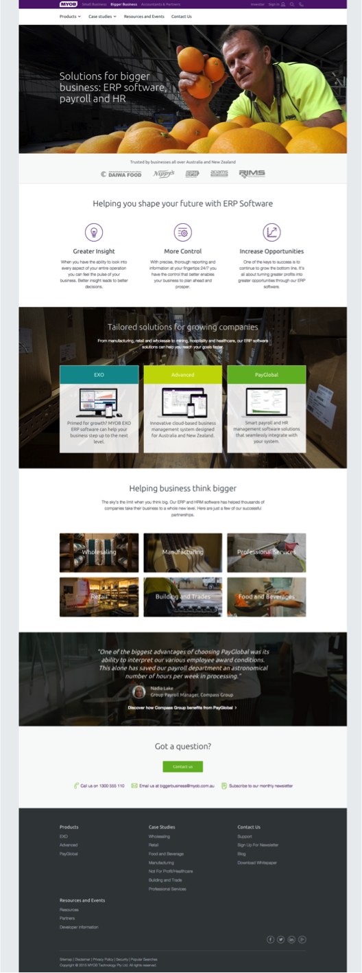
The highlighted project was a full website re-design project for MYOB's "Bigger Business" offering.
Project goal
Utilise the existing MYOB brand to create a user friendly website that generates leads for MYOB's Enterprise Software solutions.
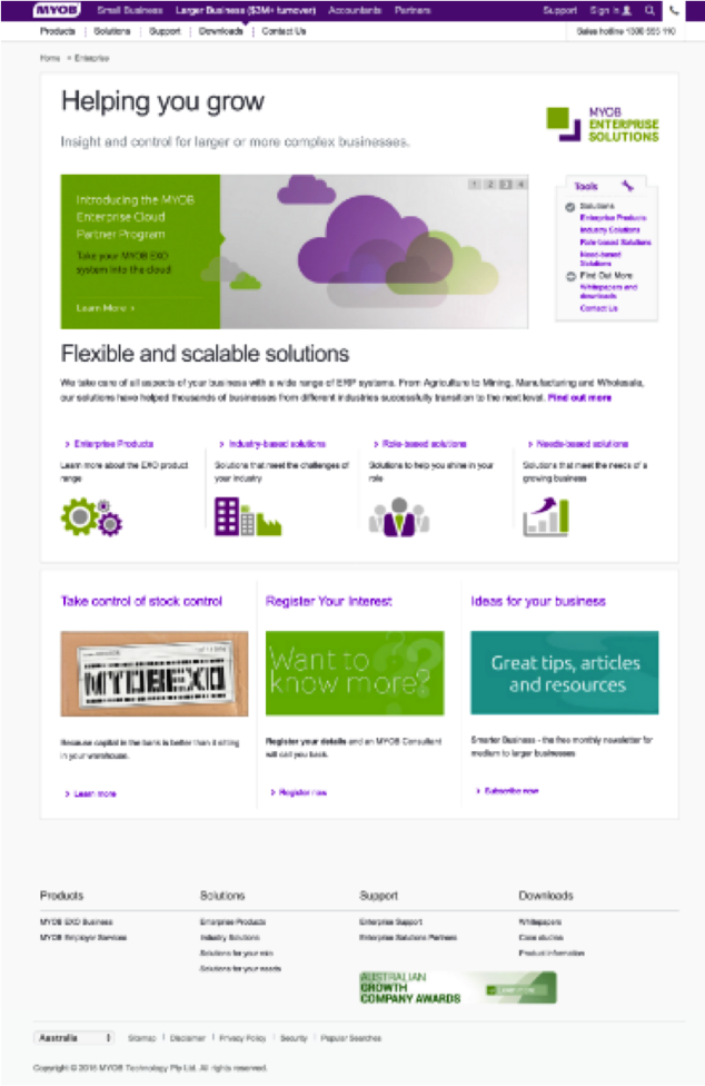
This was the old myob.com/enterprise home page - at beginning of the project.
MYOB’s small business website (selling online accounting software) had been recently transformed into an eCommerce website during 2014 — and it was the enterprise products (ERPs and HR and Payroll software) turn to be transformed. The look and feel was out of date, there were an unnecessary number of pages and unorganised content that made the user experience confusing and clunky.
There was also there was an additional internal opportunity to improve the way the online team managed website content in the CMS, as the enterprise products content was stored in an old legacy platform and this would all need to be re-worked with the new design.
We could create dynamic content modules and merge these across the rest of the website for faster development in the longterm.
Kick off workshop
The project was started by running a kick off workshop. We defined the project goals, learnt more about how this department of MYOB functioned, whether there was any existing research (market, user or competitor) and if they had any other brands they admired.
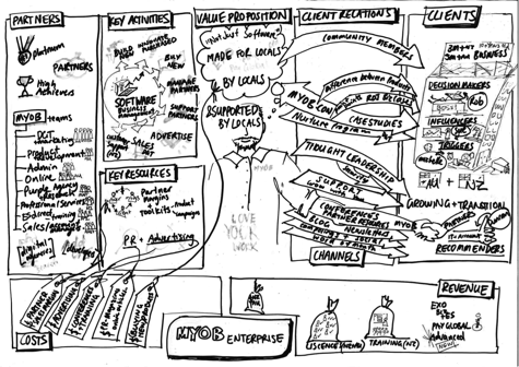
During this session I got the MYOB team to help flesh out a ‘business model canvas’ that later on became a useful tool (along with the personas) when briefing new people to work on the project. I was able to explain how the MYOB team worked using this one-page.
Business Model Canvas workshop
Business model canvas documentation infographic
Personas and User Journeys
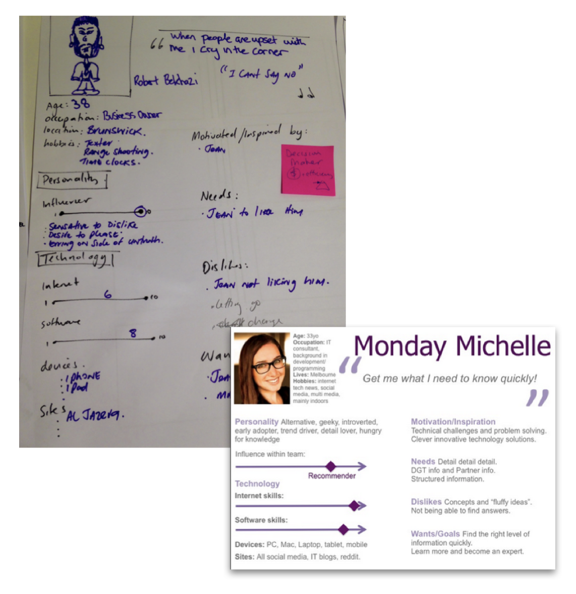
Through researching competitors websites and reviewing existing market research I formed an initial hypothesis about the key customers segments for whom the website needed to be designed. These were:
- Decision makers: who signed the contract at end of the day.
- Influencers: who influenced the decision makers decision- as they were an integral within the customers teams.
- Recommenders: subject matter experts — IT or accountants.
- End Users: office/admin staff who had to use the software their bosses had purchased, and who would complain to the influencers and recommenders if they were not happy with existing tools and processes.
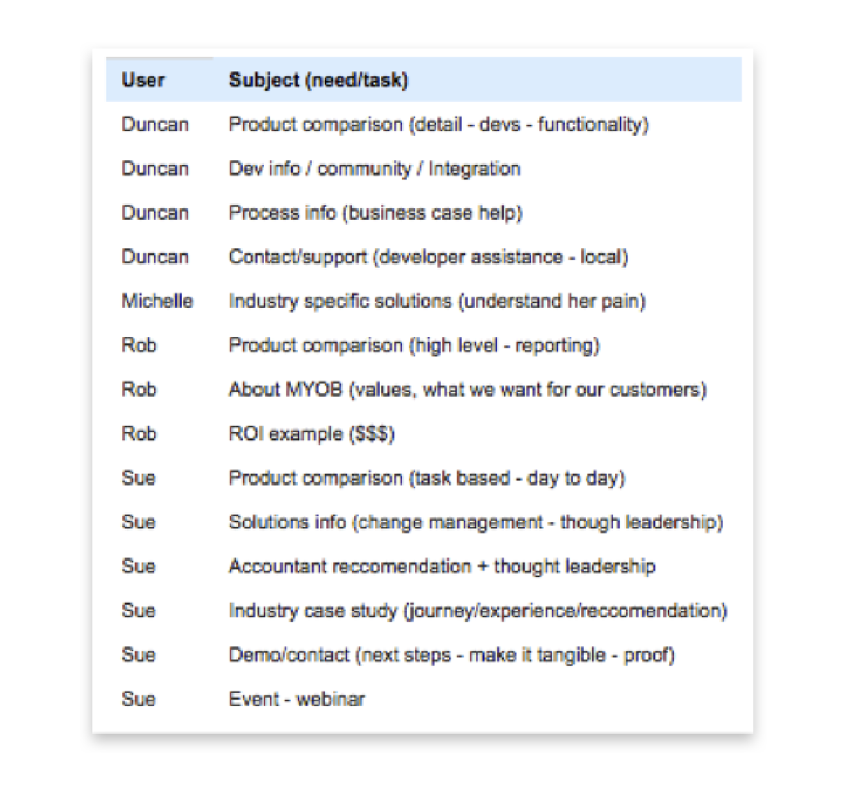
I then tested my persona hypothesis and created proto-personas in a workshop with customer-facing staff.
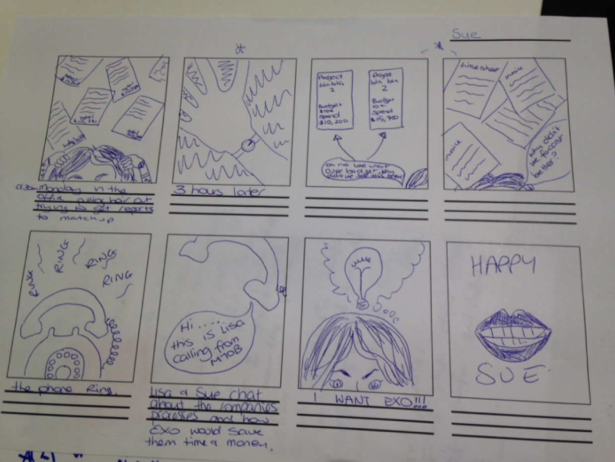
I also got the customer facing staff to sketch out the key user journeys describing in detail how these personas interacted with MYOB.
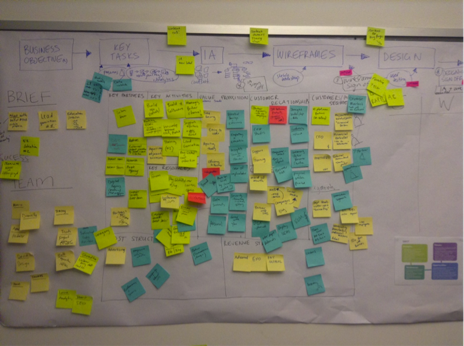
These user journeys helped me identify the online touch points for each persona, and when affinity- diagramed, I was able to see which tasks needed to be designed for which persona. So when designing each interaction we would know exactly who needed what information and where.
User journey sketch from customer-facing staff workshop
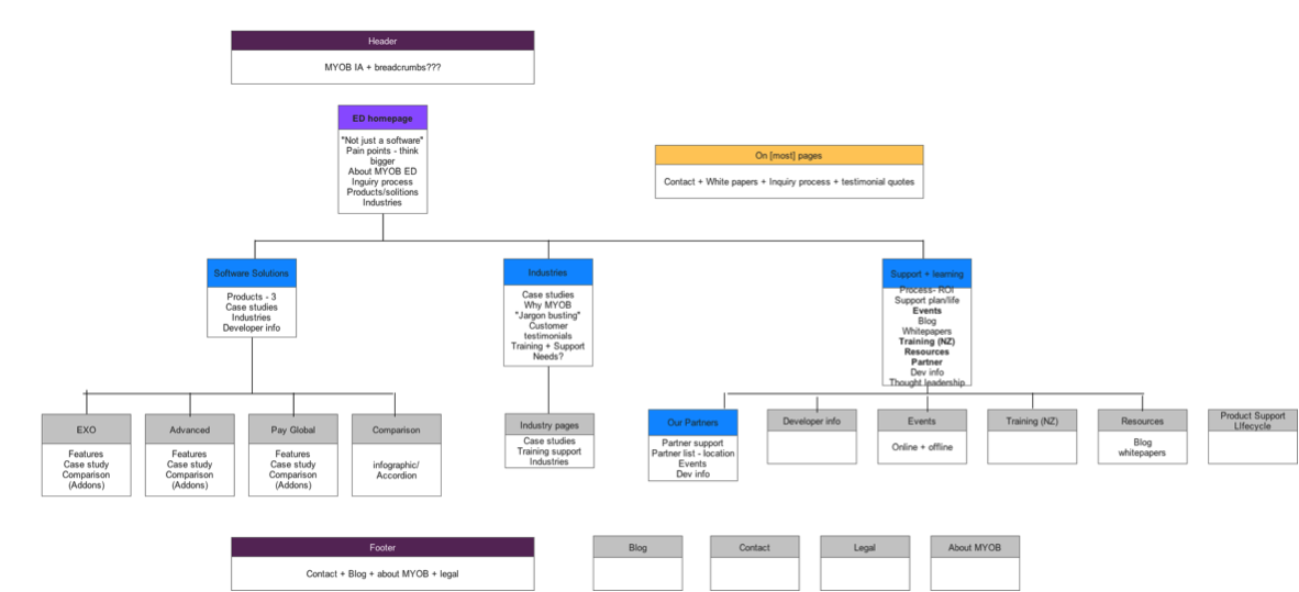
Information architecture
The user journeys also gave me a specific list of information and tasks required on the website. I got several people in the business to do an open card sort — grouping tasks and info to come up with some possible structures.
The most common content groups were identified from the results;
- Products/software
- Case studies
- Resources and partners.
Draft information architecture
I then tested the draft Information Architecture (IA) against key online tasks using closed card sorting .
The test was sent out to a customer base, and also to MYOB’s partners to ask their clients to partake.
44 customers completed the test and I was then able to edit the structure by analysing the success of each key task against the draft IA. We also wanted to make sure had the best name for each of the content groups — additional questions were included to find out what customers would call them.
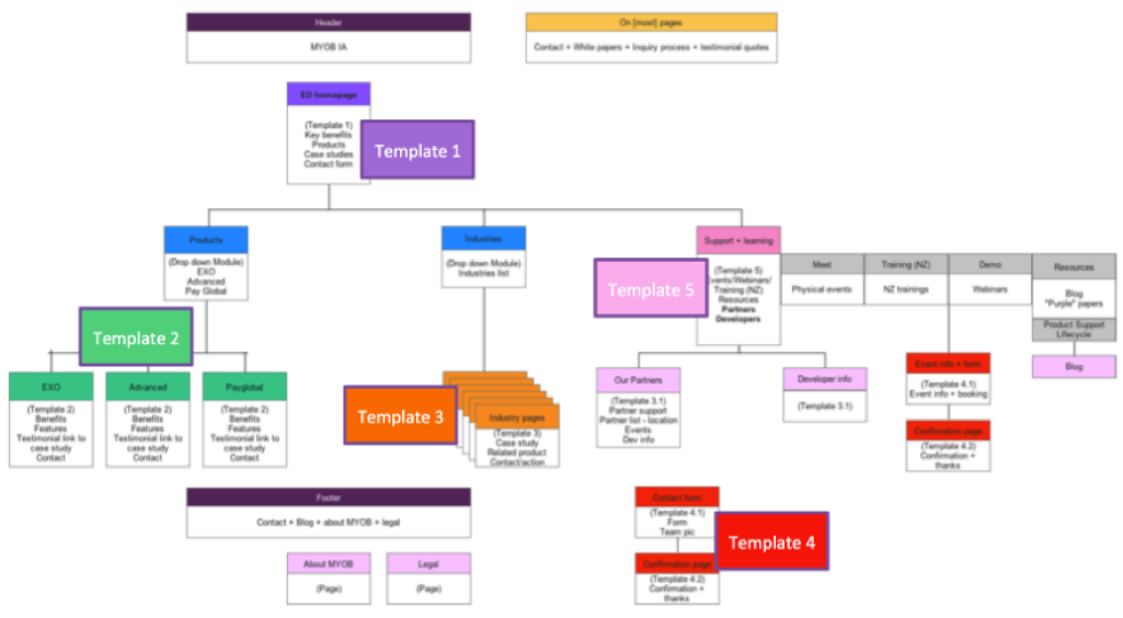
From the IA, I identified the key 5 pages (templates) that would be needed, and additional components that would be required to create the entire online experience.
Identifying key website page templates required use of the information architecture.
Wireframes, Prototypes and User Testing
Using the persona task list, IA and subject matter experts and customer-facing staff I ran a series of mini co-design workshops. We agreed the requirements for each template then each had a go at sketching what we thought the page (or element) should look like. We would then present our sketches to each other and then sketch again in silence. After 2–3 round of silent sketching our wireframes were starting to look similar.
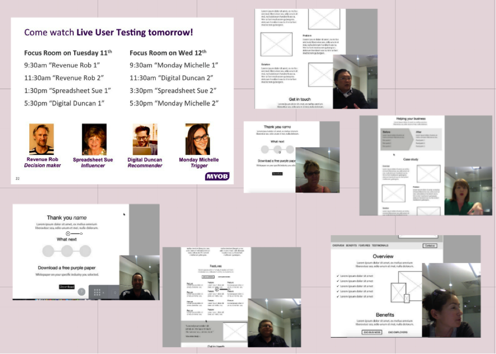
Once all the wireframes were finalised, I organised 8 user testing 1 hour sessions. 2 sessions were allocated for each persona.
Using invision and Illustrator I linked up a clickable prototype of each online task to be tested. I also set up a viewing room for myob-er’s to be able to come at watch.
The MYOB team loved it — they really learnt some interesting traits about their customers.
User-Centred Design
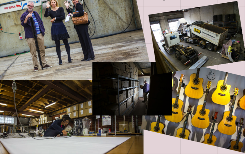
During the user testing sessions a common theme emerged - users expected to see pictures of other customers on the website . So I organised for a co-worker to visit some of the customers to take photos for the website.
In three months I underwent a user-centred design process to create the new “MYOB Bigger Business” online presence.
250 pages+ were condensed to 35 carefully constructed and user-tested pages!
“Congrats to the team on the new website, looks great and feels user friendly.”
MYOB Bigger Business Partner David Taylor, Business Hub.
Result.
